Meet+greens
Meet+greens
Meet+greens
Brand + Strategy
Meet and Greens
Client
Meet + Greens
What
- Brand workshops + strategy
- Brand + creative identity suite
- Brand manifesto + copywriting
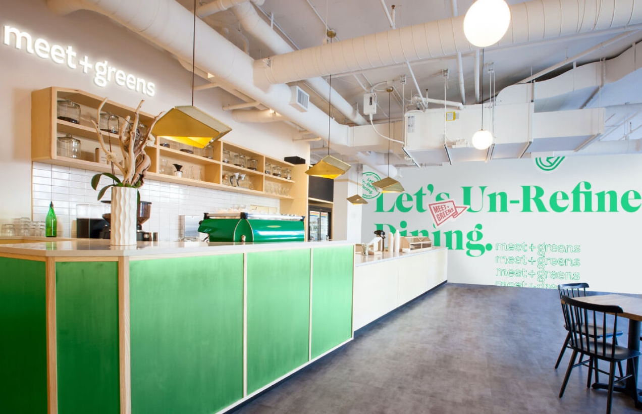
- Interior + exterior restaurant signage
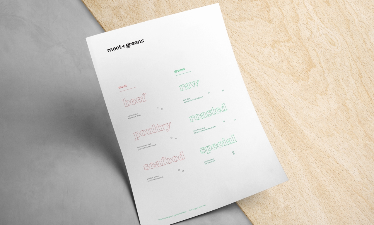
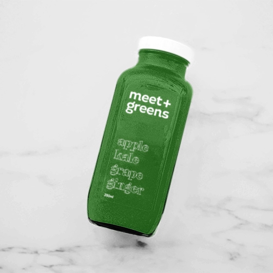
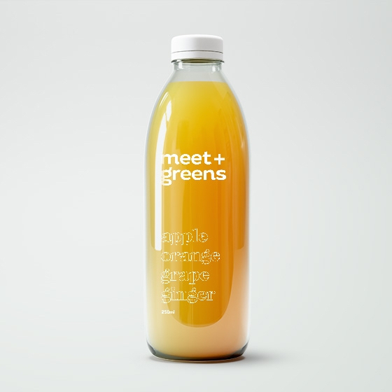
- Packaging + menu design
Food service is a fickle, competitive business in which the quality of the food is just one factor for success. To find a way onto diners’ consideration lists, new entrants to the category need to have an engaging, memorable brand and a clearly defined point of view. When we were tasked with creating a brand for Meet + Greens, a new casual dining concept aimed at affluent city dwellers and busy professionals, we went all out to make sure we delivered on both counts.
01.
The strategy
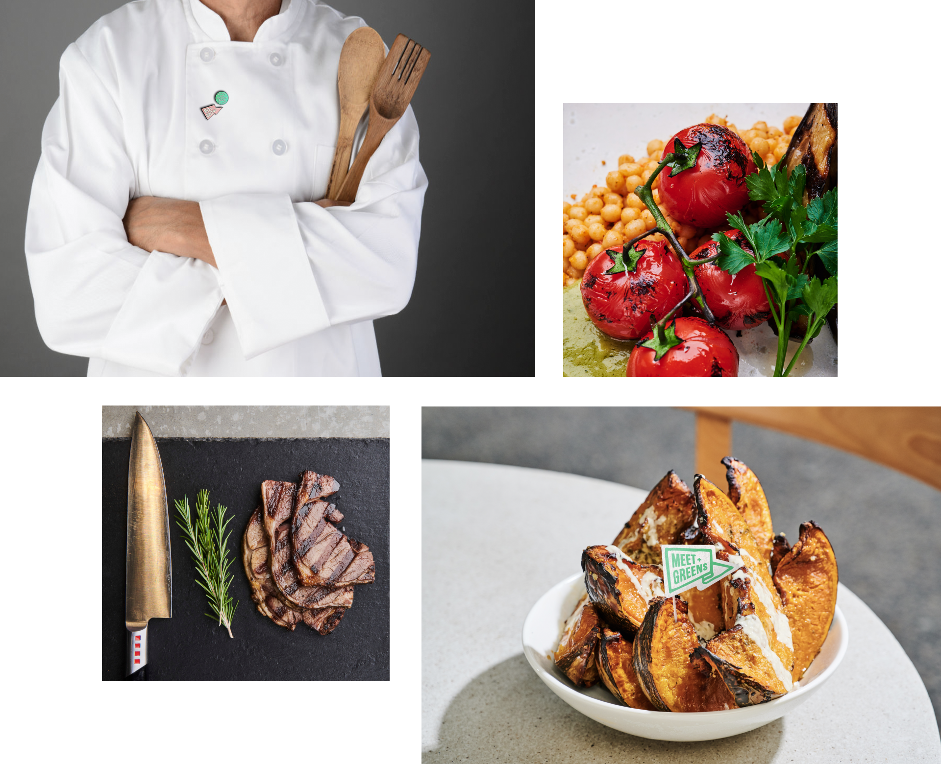
Our research showed that consumers were fed up with the lack of choice and poor standards of the fast food industry. What they wanted was convenient, everyday dining options without having to compromise on quality. Our positioning for Meet + Greens deliberately played into this space, dialling up its combination of restaurant-standard ingredients and chef-prepared meals with the ease and convenience of a fast food joint.
02.
The approach
We kicked off our brand process with a food industry deep dive, identifying the killer insights that would lead us to Meet + Greens’ sweet spot. Next, we spent time exploring the brand’s truths, traits and personality through a series of stakeholder workshops. Finally, we put it all together, developing a brand idea and position that articulated how M+G were different - and why it mattered.
03.
The brand idea

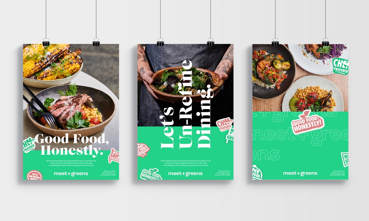
For Meet + Greens, good food is still good food, whether it’s served on a paper plate or a silver platter. Let’s Unrefine Dining speaks to the brand’s commitment to strip away the pretentiousness and exclusivity of restaurant dining to serve up good, honest food, every day. As the project unfolded, Let’s Unrefine Dining evolved into a customer-facing manifesto that positioned M+G as a brand that truly stood for something.
04.
Brand identity suite
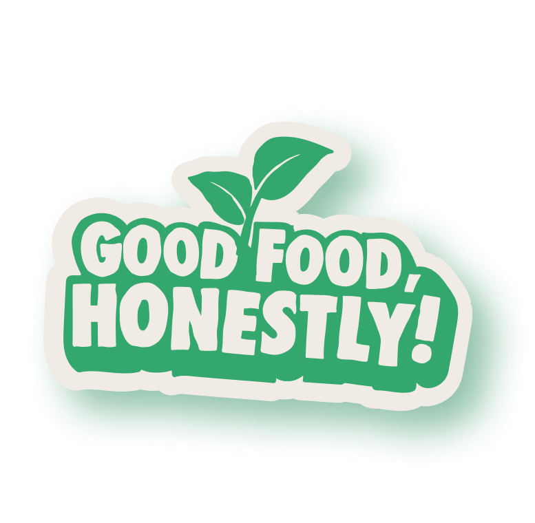
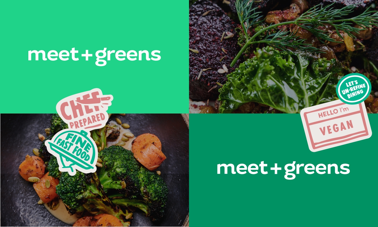
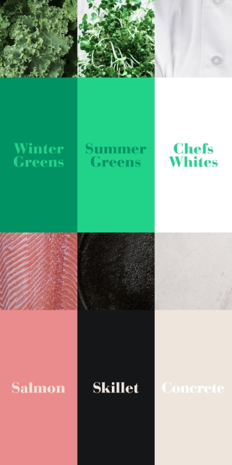
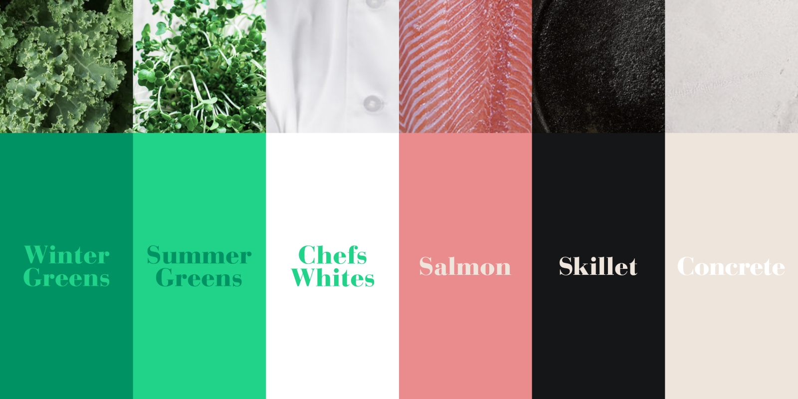
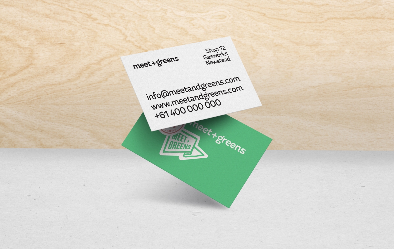
This idea of marrying convenience with quality, of combining the raw with the refined, helped to shape the visual identity of the brand. We contrasted a sophisticated colour palette and traditional typeface with unexpected and subversive elements to deliver playful messaging that aligned with Meet + Green’s mission to unrefine dining. Inspired by the clashing ideas of fruit stickers (raw) and meat quality stamps (refined), we developed a set of stickers and badges that could be applied to a range of environments and executions to subvert the message and add personality.
Brand workshops + strategy
Brand + creative identity suite
Brand manifesto + copywriting
Interior + exterior restaurant signage
Type + Pixel took my initial vision for Meet + Greens and evolved it into a meaningful brand with something to say. It was clear how invested the team were in the project and that came through in the quality of the work.
