Online Course Australia
Online Course Australia
Online Course Australia

Online Courses Australia
Online Courses Australia
Client
Online Courses Australia
What
- Customer research
- Brand workshops + strategy
- Brand + creative identity suite
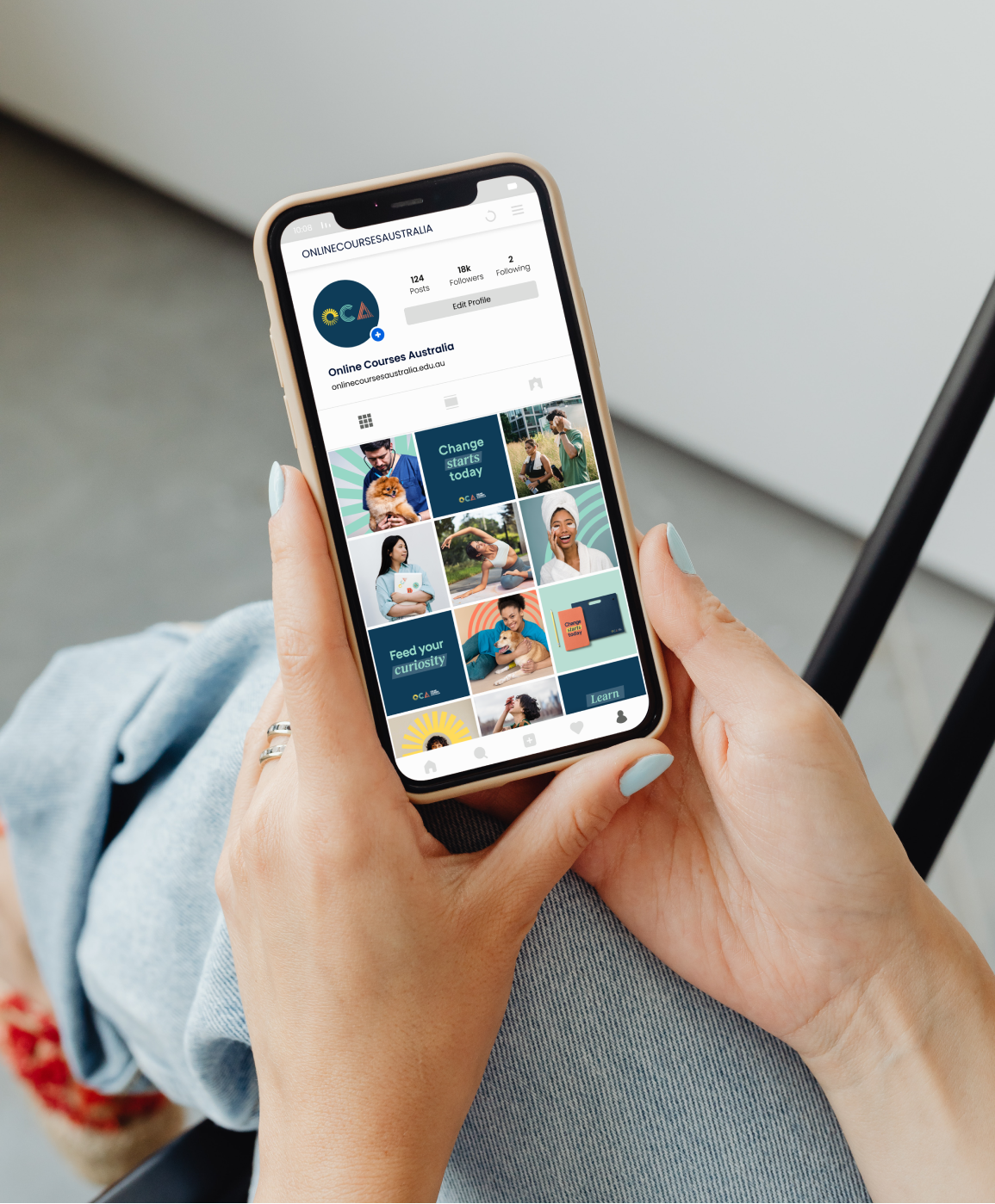
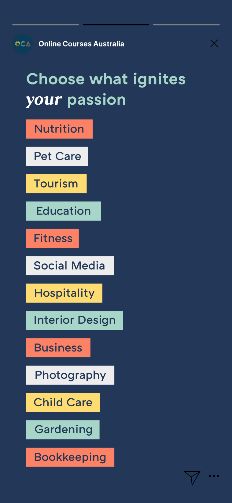
- Social media guidelines
- Copywriting
- UI design
The education sector is changing. Post pandemic, the shift to online delivery and the demand for more flexible, accessible learning options has seen traditional institutions struggle to adapt and remain relevant. For Online Courses Australia, who’ve been delivering digital learning for over a decade, the time was right to level up their brand and position themselves as true innovators in learning.

01.
The strategy
OCA students aren’t your typical, parent-funded undergrads with four years to spare. They’re looking to learn a new skill, brush up their resume, build their confidence or simply test the waters. What’s more, they want to do it on their own terms, at their own pace. Our strategy tapped into these insights, positioning OCA as passionate, inclusive innovators, driven by the belief that learning is life-changing and should be accessible to all.
02.
The approach
To help OCA to stand apart in an increasingly cluttered space, we needed to get to the heart of what makes their brand unique. So we talked to students, lecturers and stakeholders to help us identify the themes and insights that would inform our brand strategy, mapping them against competitor brands to identify opportunities for differentiation.
03.
The brand idea

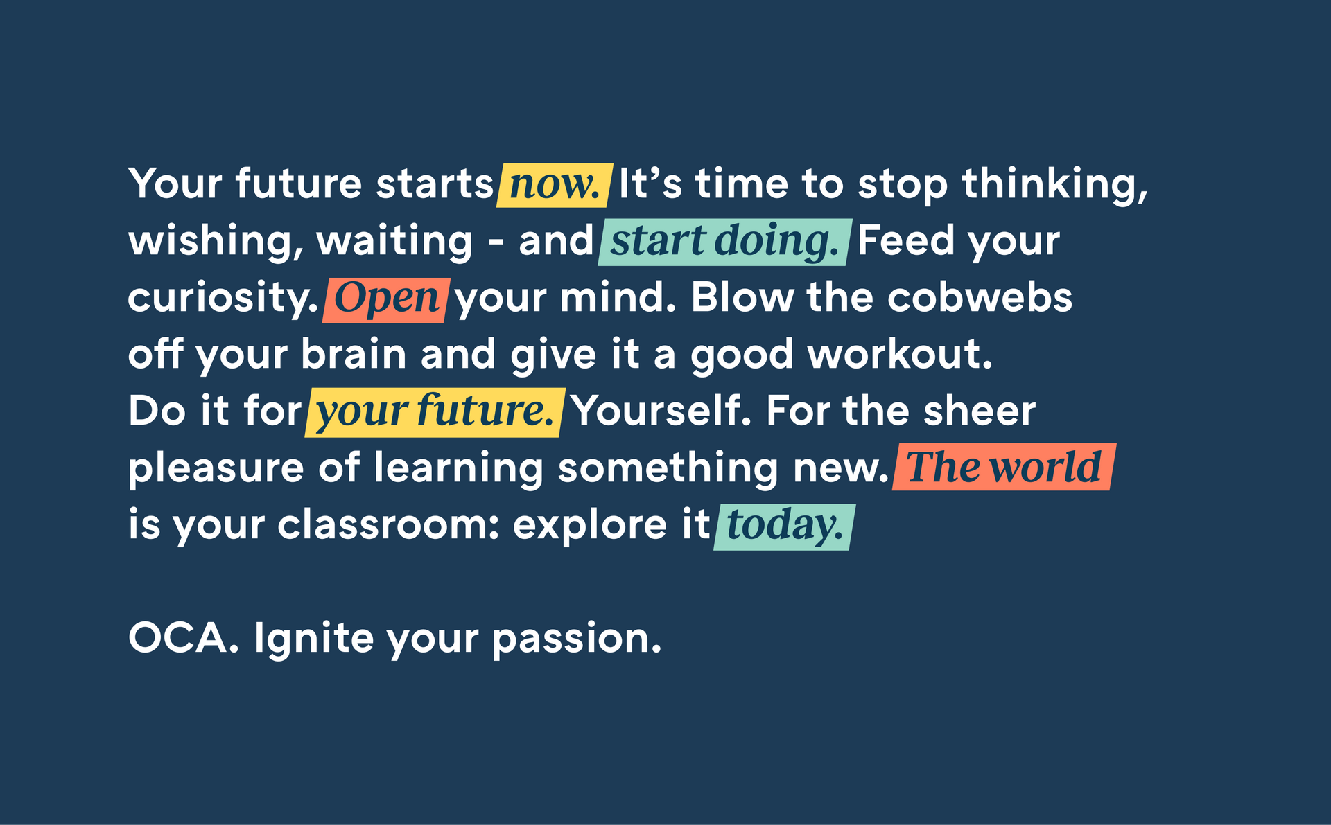
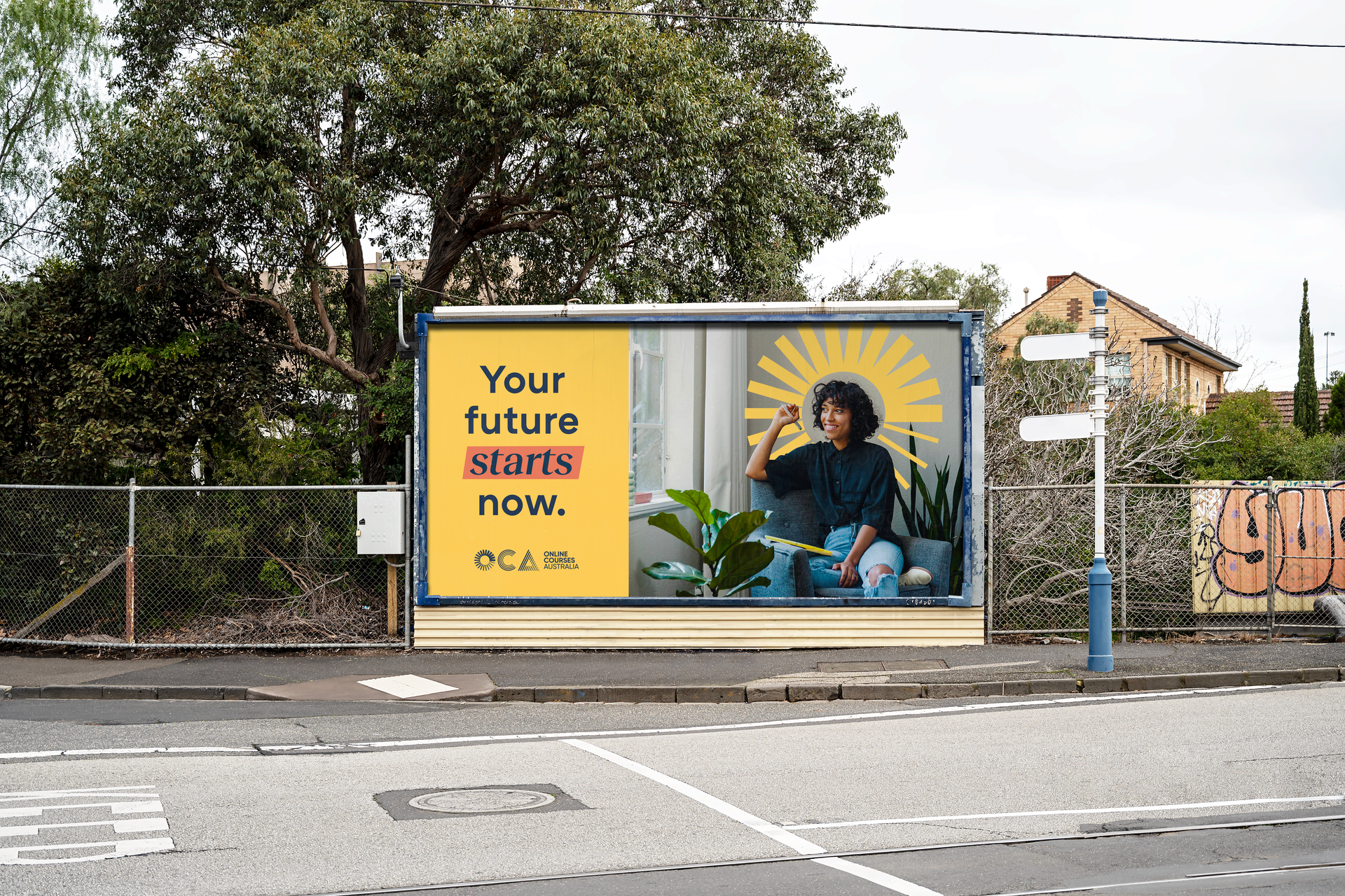
Next, we distilled our strategy into a single thought that would shape our creative expression and tone of voice. ‘The spark’ speaks directly to OCA’s role as the catalyst that ignites students’ love of learning.
04.
Brandmark
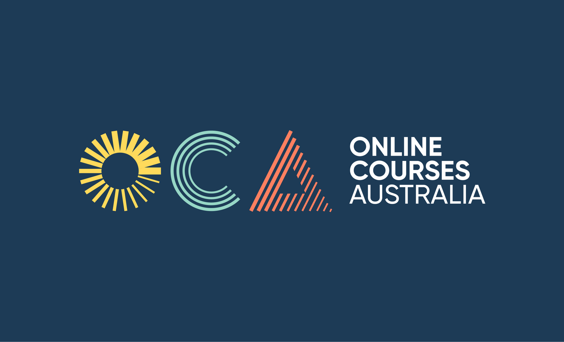
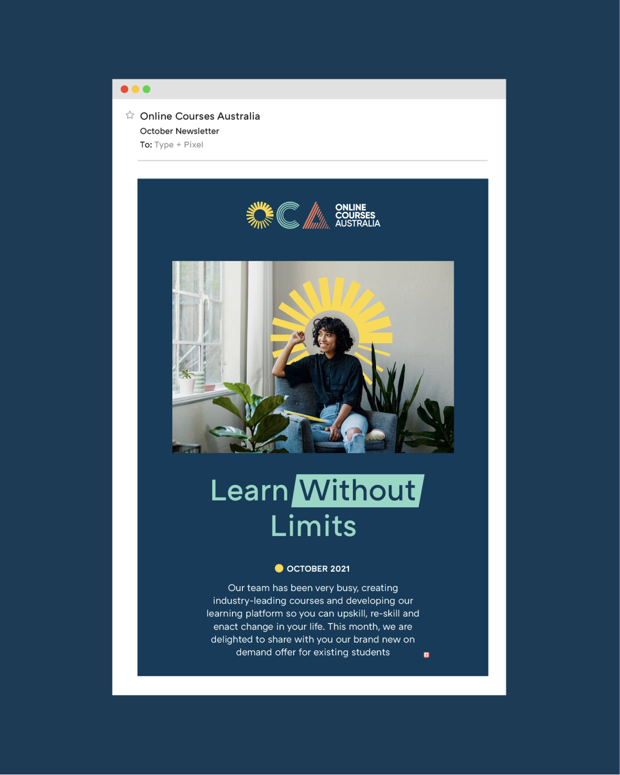
As a digital-first brand, Online Courses Australia required a flexible mark that could adapt to different online environments. So we shortened its name to OCA, applying a unique treatment to each letter to communicate key elements of the brand. The O becomes a stylised spark, the C represents connection, while the A becomes a triangle pointing upwards to represent growth and ambition.




Customer research - Brand strategy
Identity - UI / Copy Identity

The impact of Type + Pixel’s work on our brand was immediate. Upon rolling out the new UI designs across our digital channels we saw an unprecedented uplift in sales, while the average order value on our site more than doubled.
07.
The results
YOY sales
↑180%Average spend
↑54.5%Time spent on site
↑37%Product detail views
↑173%

